Radicle Brand & Website
A way to collaborate on code built on a p2p protocol instead of hosted on centralized servers. Here’s the story of the process of developing the brand and website.
Role: Brand design, Icons, Illustration, WebsiteWe started with an easygoing idea session with the whole team where everyone designed some Radicle-inspired posters. This helped us get a sense of what the brand was from those working on it (not just me!). It was a really great team building exercise and also helped me get an idea of where to start with the brand. (Thanks Ele for the idea).
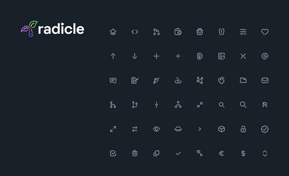
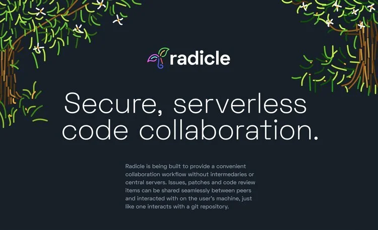
CONCEPT 1The first concept was supposed to be a natural extension of the the style of the app. It was loosely based on the app’s icon set I drew. This direction reminds me of a vintage tech brand (think Apple, NeXT, and IBM in the 90s) which seemed to vibe with Radicle, but in the end felt a bit too normy and polished. I spent way too much time drawing these illustrations.
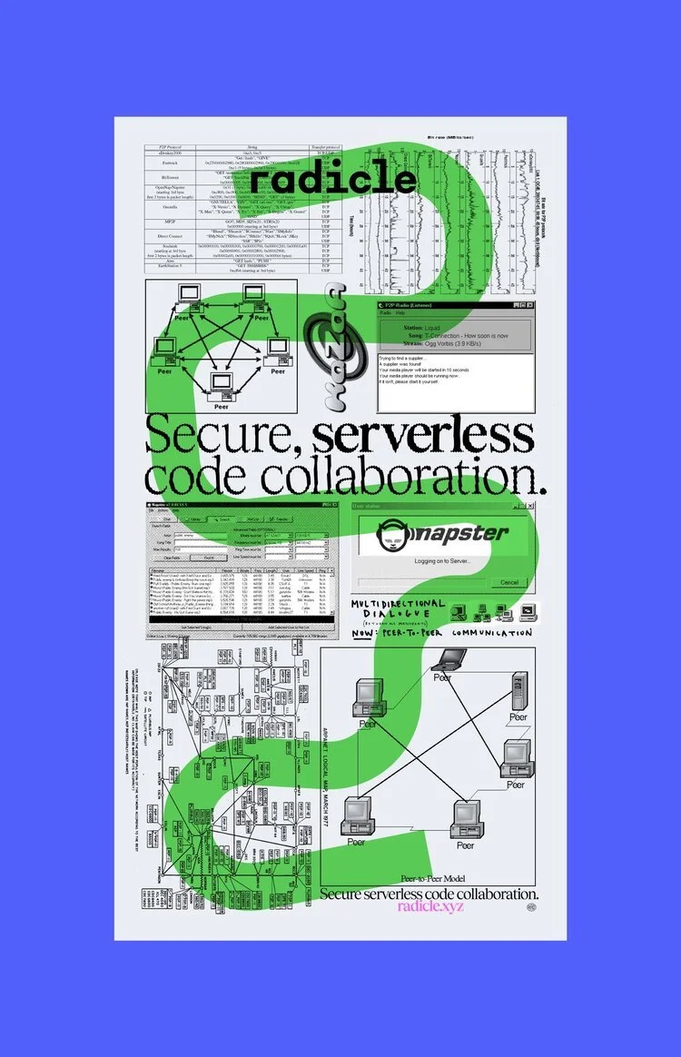
CONCEPT 2The second was supposed to be sort of zine-themed. Balancing a zine aesthetic with nice serif typography was cool, but ultimately it felt a bit forced and the random p2p graphics didn't really feel relevant. TBH I was totally trying to rip off the Boot Boyz aesthetic anyway. 👏 NEXT ⬇️
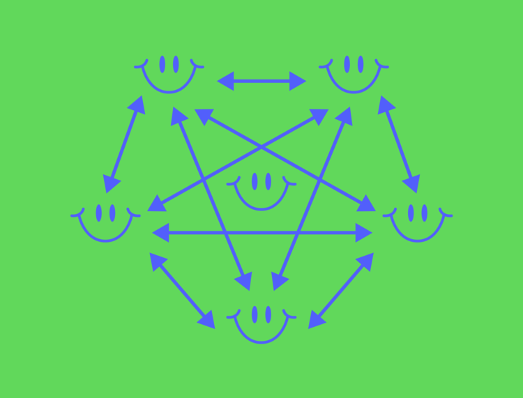
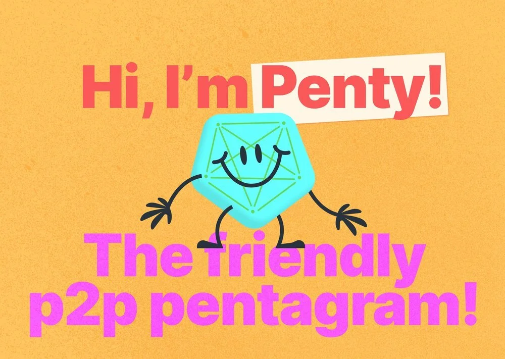
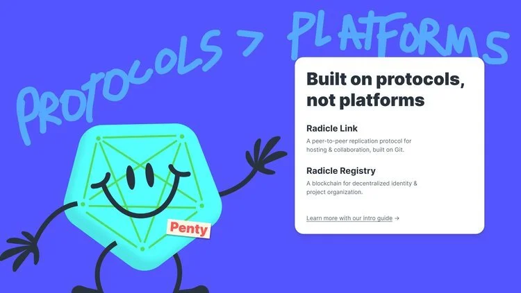
CONCEPT 3The third one really went hard on the “coding with friends" idea. I even developed a character (Penty the Friendly P2P Pentagram 😅😂) but honestly this direction felt way too childish … kind of like a code school for kids or something. I still think about Penty sometimes. 🥲
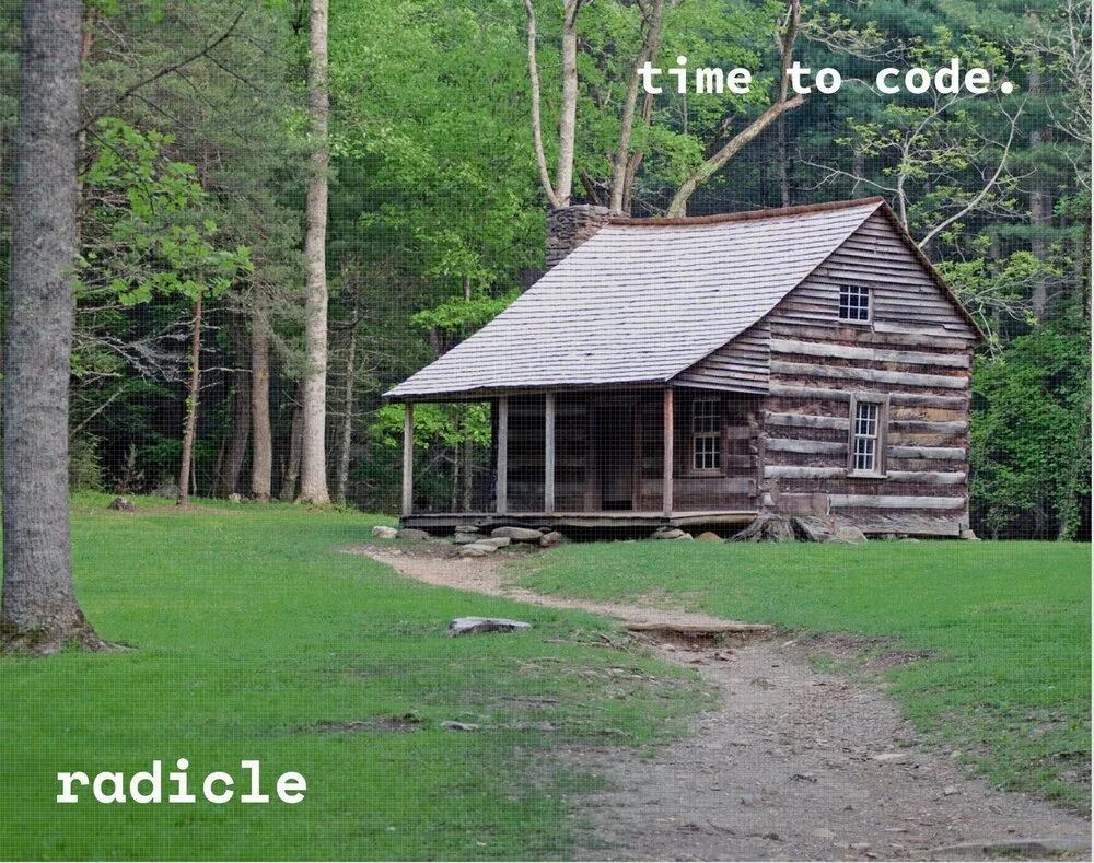
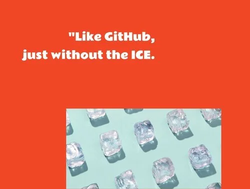
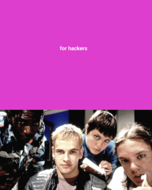
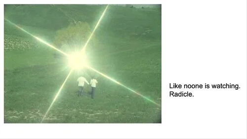
CONCEPT 4The last one was just bonkers. I am honestly crazy4this1. But uhh hear me out: what if Radicle was a cult. I might have watched too many documentaries on cults, idk. Conceptually the idea is pretty awful. (Cults are bad.) But there was something there. Think cult status.
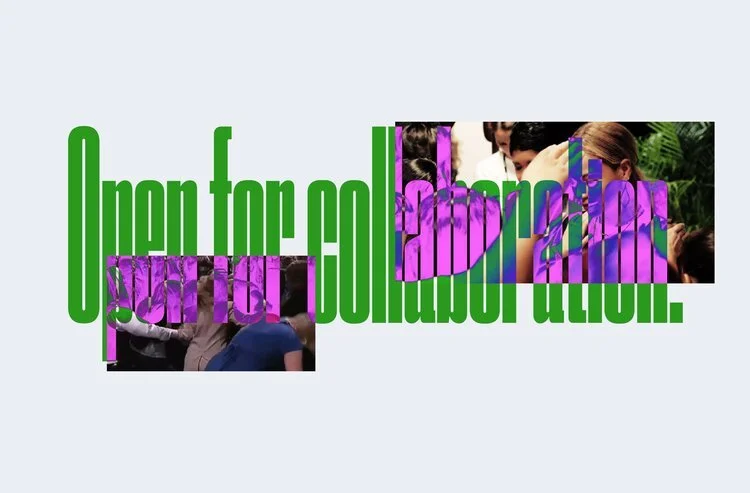
And we ended up going with it. This direction felt the most honest and raw. The aesthetic was cool but the cult imagery was awful and needed to change so we swapped cults for Internet art and WE GOT A BRAND©®™.
The Website
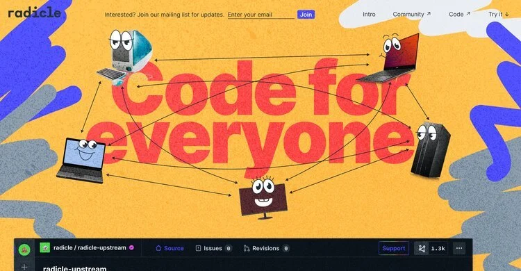
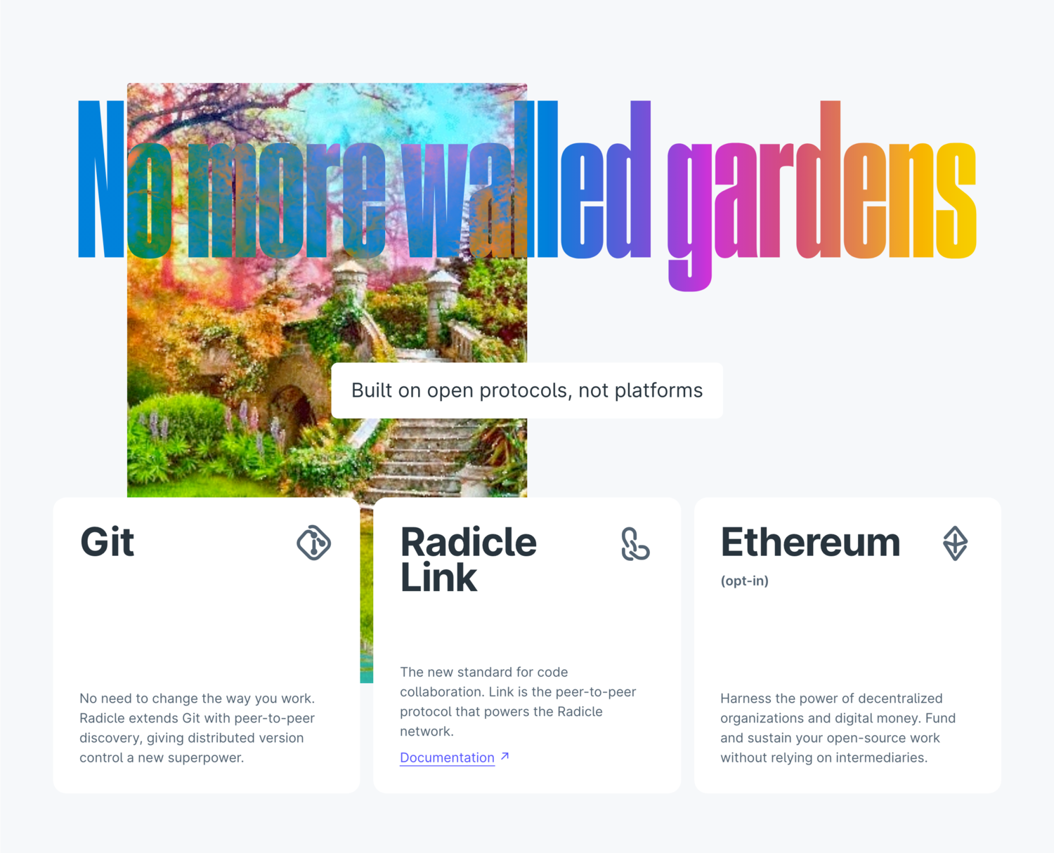
While doing branding is honestly all just fun and games, we had a complicated p2p code collaboration ecosystem to explain. 👎 Boring right? No! The site then extended to explain the full ecosystem of the tech behind Radicle.
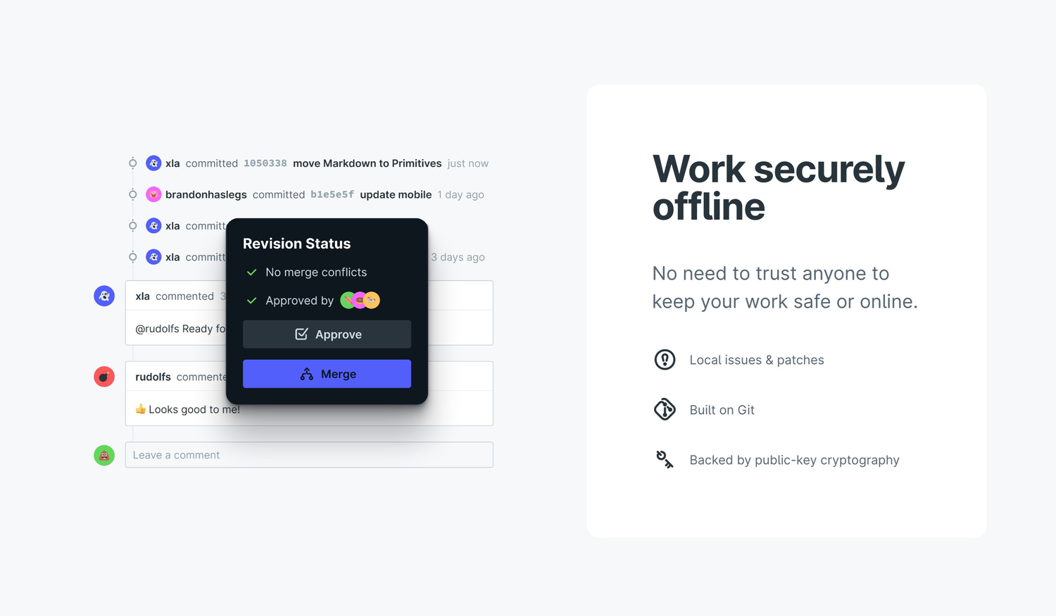
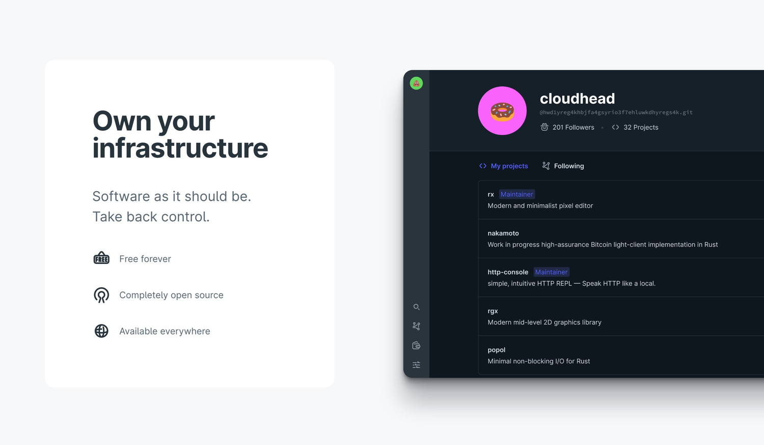
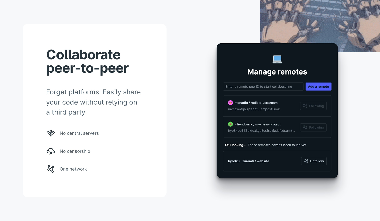
🖋 VIEW FIGMA FILEWe tried to avoid jargon as much as possible while still explaining the product in a super clear way. Abbey, Alexis, Ele, and Ange really nailed the copy. Paired with screenshots from the UI, it was a big hit. People mostly got it. Or they got distracted by the GIFs.
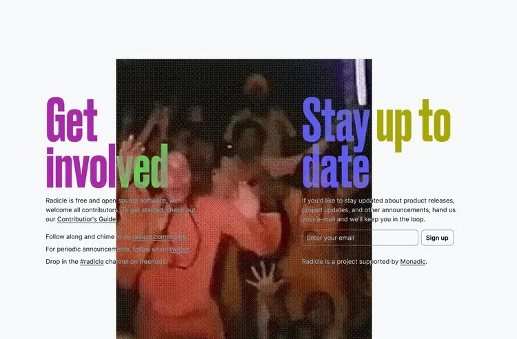
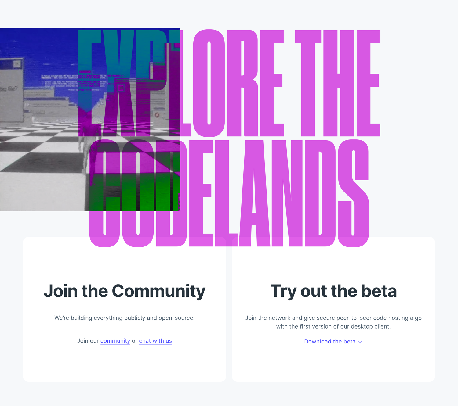
The two main calls to action besides signing up for the mailing list are to get involved with the community, and download the beta.
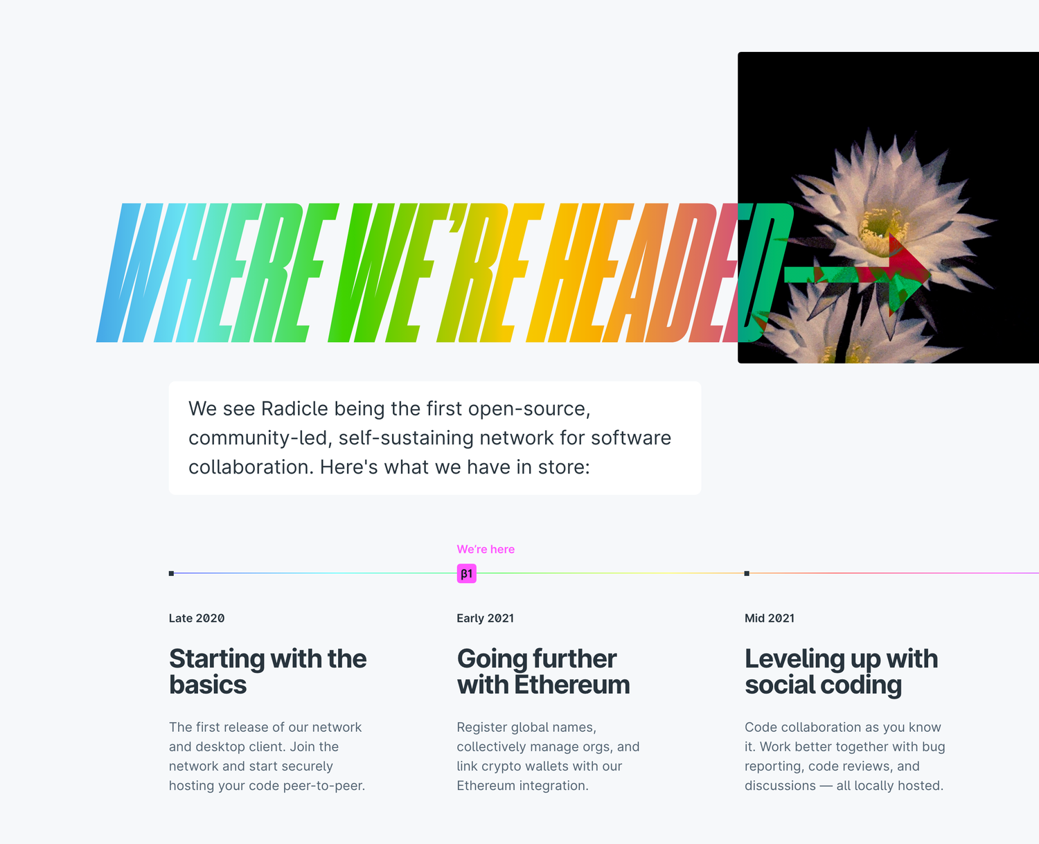
Roadmaps are hard. We tried to keep ours vague enough to not disappoint people, but with specific enough general features to help people understand our plan. So far, it’s been accurate.
