Grover
Grover is a service that allows users to rent tech products monthly instead of buying them. I led the design team to redesign the full product’s many facets.
Role: UX, UI, Illustration, Iconography, PrototypingView it live: grover.com
Category navigation
Categories are often a mess of dropdowns and complex site structures. With the rainbow-themed, two-layer category dropdown I made that experience a bit more delightful.
In the implementation, we built a hidden usability-enhancing front-end trick: by drawing an invisible triangle from the user’s cursor to the list of subcategories on the right, the user can move from left to right within that triangle without accidentally selecting other categories along the way. The best thing about this feature is that users probably don’t even notice it.
To go along with this rainbow-colored category experience, I drew 44 icons representing each product category.


These category icons and colors bring life and color to other parts of the product, where products are themed by the category color.

“The catalogue is much more visible. It looks tidy and modern.”
From a Grover customer survey sent out after the launch.Illustration
I worked with Penny to define a fun, friendly new illustration style. We wanted to do something that made the service feel easy to use and lighthearted.
Illustrations for the How it Works page.


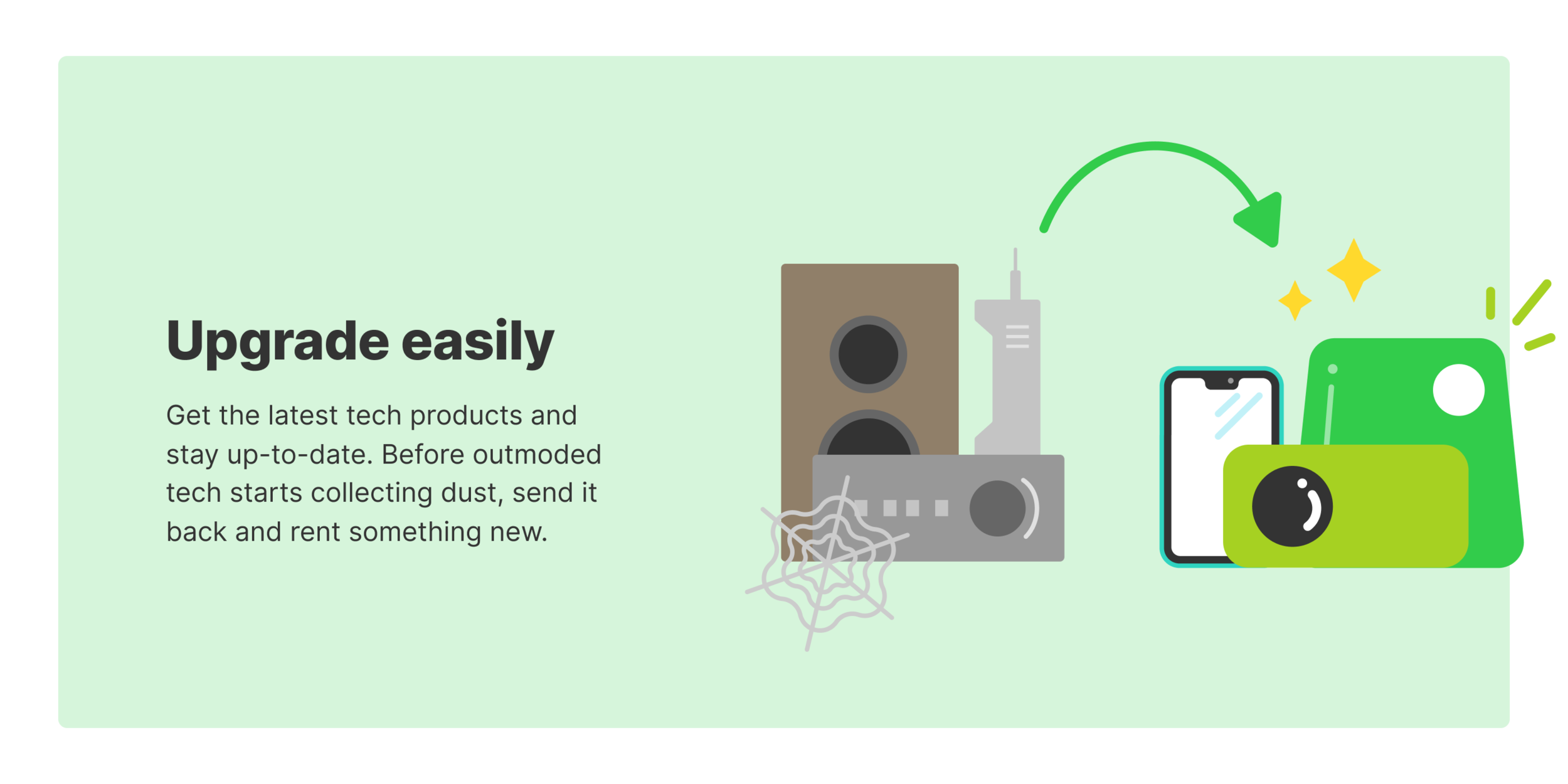


Spots illustrating the benefits of renting with Grover.

90% damage coverage.

Environmentally friendly.

No paperwork.

Flexible rental plan switching.

Over 2,000 products.

Do more with your money.
Illustrations guiding the sign up experience.

Out of stock.

In a poll of our users, 74% responded that the new design was a positive change.
Product Discovery
To give users a new way to discover products and keep the experience fresh and automatically updated, we built a product feed that shows something new each time the page is visited. Rules like “Show the top product from the top 4 categories in the first row” satisfy business needs while also showing users the hottest products right now. Rules like “Show the top products in a random category” enable discovery of new products that users might not know we have. “Display a random collection” lets users dive deeper into our curated content.
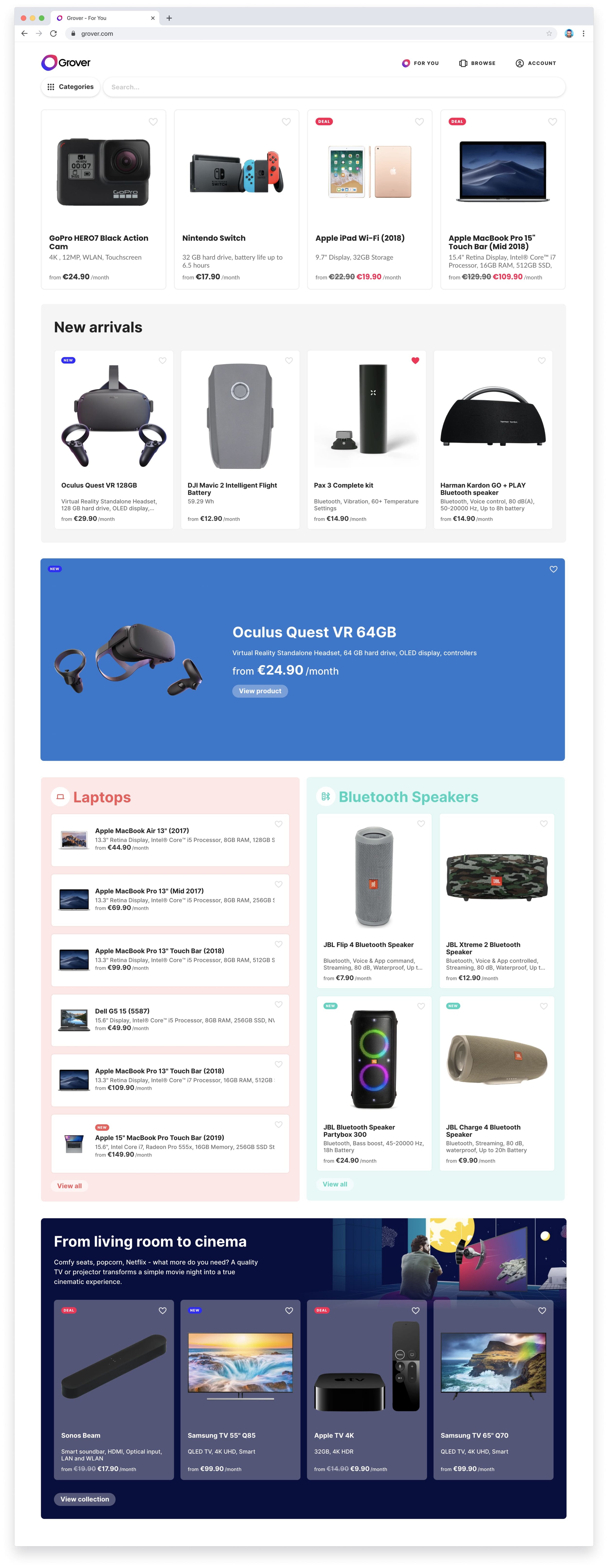
Product Details Page
A lot of ad traffic is sent directly to the product detail pages, so on these pages we had the unique challenge of showing all the product details in addition to explaining how Grover works. The result is a long page with tons of information on it, structured in a way that answers new users’ questions about Grover.

“The design is more modern. You know directly that it’s the market leader.”
From a Grover customer survey sent out after the launch.Previous project
8-bit Products
Next project