Slack
This Slack branding concept was done while Slack was in the process of considering revitalising their brand. In addition to exploring things closer to their existing brand, I designed this completely new concept.
Role: Concept, Design, Lettering; Made at Fuzzco
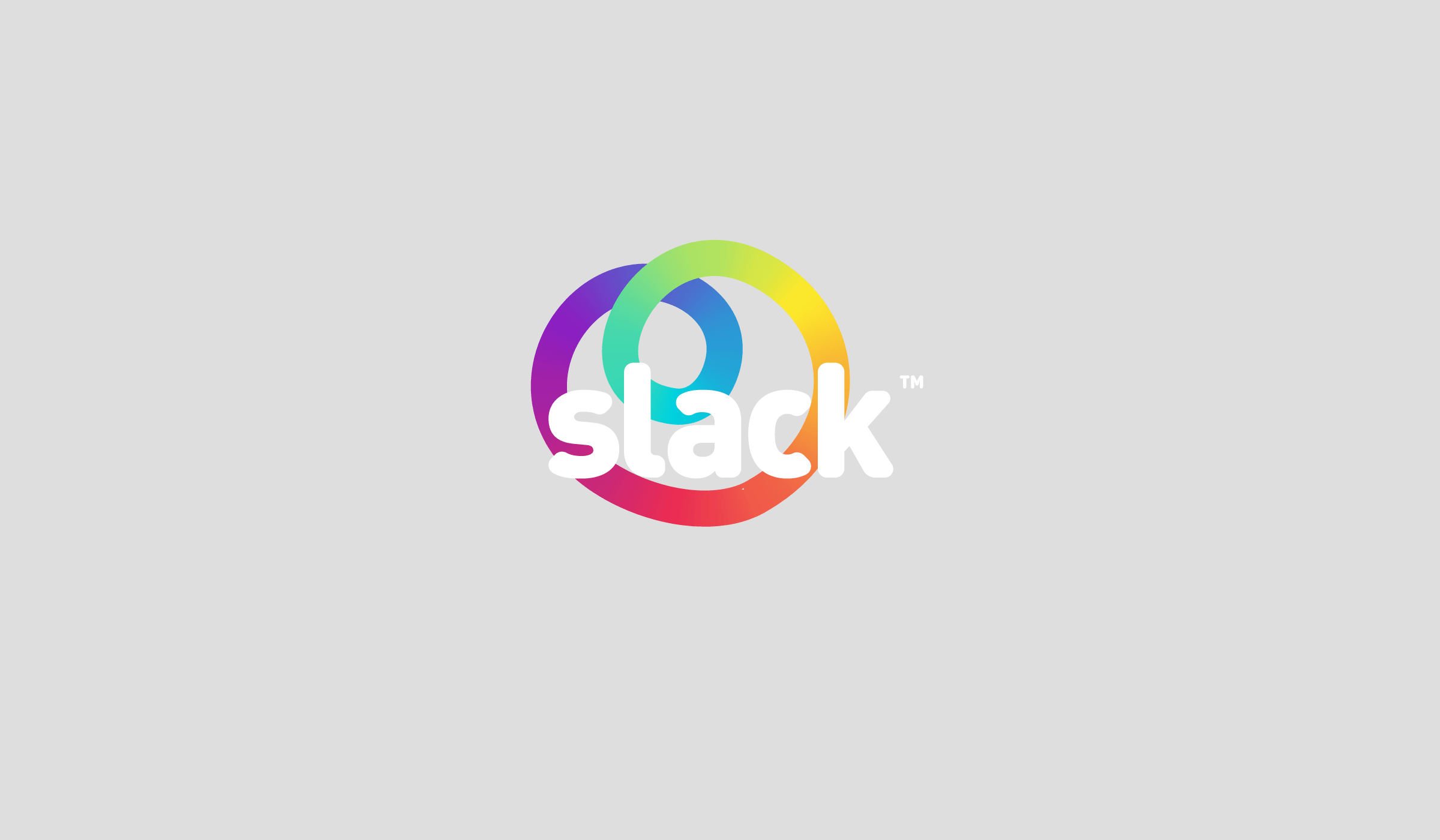
The stretchy rainbow-colored band represented working on a team together in perfect cohesion. The logo could be seen in any combination of stretchiness, just like Slack can be used in any combination of organizational structures.


I designed a full lowercase alphabet to be used sparingly in advertising and swag materials.


A Slack Sloth was drawn. 🤷♂️

Holographic business cards were designed to bring a bit of interactivity to a printed material.

A playful tagline of “Do more. Work Less.” Conceptually, this plays with the typical startup mentality that says you have to DO MORE to be successful. Because of the treatment of the colorful lettering (made to look like confetti or decoration), “Work less” actually falls to the back so that the message is read in the right order.

Standard-issue startup t-shirts.


Less-standard-issue startup t-shirts. 🌈🤙

How the logo looks on a photo background and a one-color version.

